
Community Commons has partnered with Kaiser Permanente and the Every Body Walk! campaign to spread the message that walking a total of 30 minutes a day, five days a week really can improve your overall health and prevent disease. Add your footprints to the movement by using the maps below to explore your community assets and opportunities and make the case for better pedestrian infrastructure.
You can make your own maps by visiting the Maps & Data page.
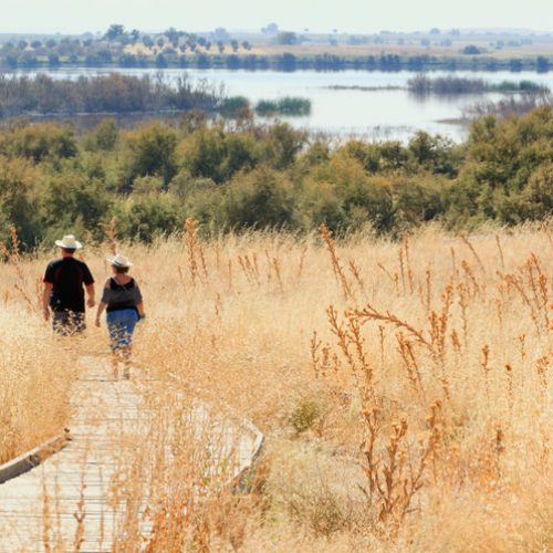
Measuring Walkability

Walk Score Ranking, Walk Score® 2012. Zoom to your own location by clicking on the map and entering your city, county, or zip.
Walk Score is an organization that issues a ranking to over 2,500 cities in the United States. The walk score for a location is determined by its access to amenities. A higher score indicates that an area is more accessible to walking while a lower score indicates a more vehicle dependent location. WalkScore.com considers the range of scores as follows:
0-24: Car Dependent (Almost all errands require a car)
25-49: Car Dependent (A few amenities within walking distance)
50-69: Somewhat Walkable (Some amenities within walking distance)
70-89: Very Walkable (Most errands can be accomplished on foot)
90-100: Walker’s Paradise (Daily errands do not require a car)
Another measure of walkability is through the Pedestrian Road Network Density. This measures how easy it is for a pedestrian to travel in an area by looking at the number of pedestrian-oriented roadways as well as the number of intersections of those roads. A higher rating, indicated on the map by darker shading, means travel by walking is easier to accomplish and is considered safer.

Pedestrian Road Network Density, EPA SLD 2011. Zoom to your own location by clicking on the map and entering your city, county, or zip.
Combining Data to Paint a Picture
When the walkability maps are overlaid with other data, they provide a clear visual for areas of need. For example, when the locations of Supplemental Nutrition Assistance Program (SNAP) retailers in the Omaha, Nebraska area are placed on a Walk Score map, it shows how some parts of the city provide pedestrians with easier access to those food retailers. It also highlights where the city can look into improving infrastructure for pedestrians.

SNAP-Authorized Retailers, USDA SNAP Locator Aug. 2013 and Walk Score. Zoom to your own location by clicking on the map and entering your city, county, or zip.
Another example shows how walkability relates to schools. The percentage of students that walk to school has decreased greatly as campuses are being placed further out into suburban areas. These locations often lack connections to neighborhoods and walking infrastructure.
This map of Nashville, Tennessee shows how low walk scores and poor pedestrian road network density are the norm around public school locations. The community can use this information to target areas for infrastructure improvements around schools and to better plan the location of new schools.

All Public Schools, NCES CCD 2010-11 with Walk Score and Pedestrian Road Network Density. Zoom to your own location by clicking on the map and entering your city, county, or zip.
Other Useful Maps for Case Making

Transit Stops and Stations, EPA SLD 2013. Zoom to your area by clicking on the map and entering your city, county, or zip.

Pedestrian Motor Vehicle Accident Mortality, NHTSA 2008-10. Zoom to your own location by clicking on the map and entering your city, county, or zip.

Workers Traveling to Work by Walking/Biking, ACS 2007-11. Zoom to your area by clicking on the map and entering your city, county, or zip
Create your own maps
Our support page features many videos and training materials so that you can use the Commons tools to really make change in your community.
Source: Community Commons
June 24/2014
By Michelle Windmoeller
http://www.communitycommons.org/2014/06/walking-maps/